How to Visualize Biological Data Using a Heatmap
18 Jan 2018
One day, a good friend of mine gave me some of her data to play with. These were measurements of neurite growth rate from wildtype and transgenic animals. To get this data, she had to do ‘live-imaging’ of neurons, meaning that she put neurons in a culture dish filled with nutrient broth, provided a nice warm moist environment while taking pictures of them every minute, for set periods of time, say a few hours. It takes patience and meticulousnous, as is true for a lot of biological experiments.
What I want to do with this data, is to be able to visualize neurite growth rate at different time intervals, and be able to see whether neurites from wildtype animals behave differently from those of transgenic animals. One way to do so is to plot the data in the form of heatmaps.
Step 1
She provided me the data in the form of an excel file, so the first step is to import that into Python, in addition to importing modules that I’ll need:
import numpy as np
import pandas as pd
import matplotlib.pyplot as plt
data = pd.read_excel('Neurite growth rate file')
Step 2
Next is to set up the area, or the grid where I will plot the data points
u = np.linspace(0, 116, 117)
v = np.linspace(0, 22, 23)
X,Y = np.meshgrid(u,v)
Step 3
Finally, plotting the data and showing it nicely
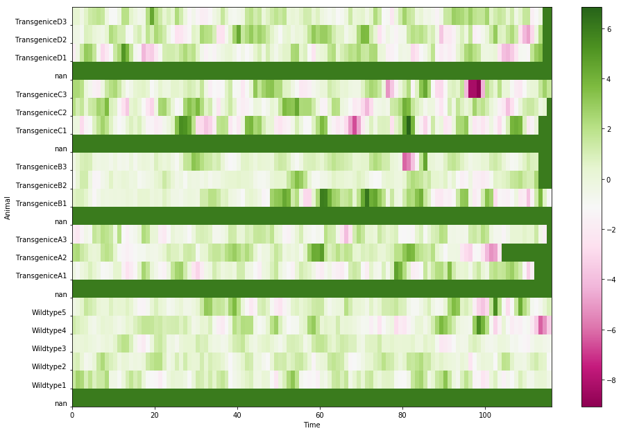
Z = data.fillna(5)Note: Here I chose 5 as the the substitute value for null data points. I find it tricky in deciding what value to choose, as I cannot find an easier way to tell Python to simply ignore the null data points. Also, the value that I chose affects the scale of how the data will be presented (see later)
plt.pcolor(X, Y, Z, cmap=plt.get_cmap(‘PiYG’)) plt.subplots_adjust(left=0, right=2, bottom=0, top=2)
plt.ylabel('Animal')
plt.xlabel('Time')
yindex = range(0,22)
ylabel = list(slope_fillna.index)
plt.yticks(yindex, ylabel, va = 'bottom') #'va' stands for 'vertical alignment'
plt.colorbar()
plt.show()
An alternatively way is simply using the Seaborn library
import seaborn as sns
plt.figure(figsize = (16,10)) # to change figure size
image = sns.heatmap(slope, annot=False, annot_kws={"size": 10}, xticklabels=5)
sns.plt.show()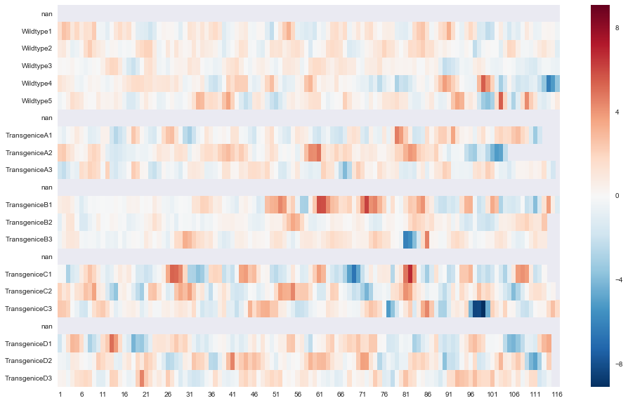
This is much easier, as only a few lines of codes needed.
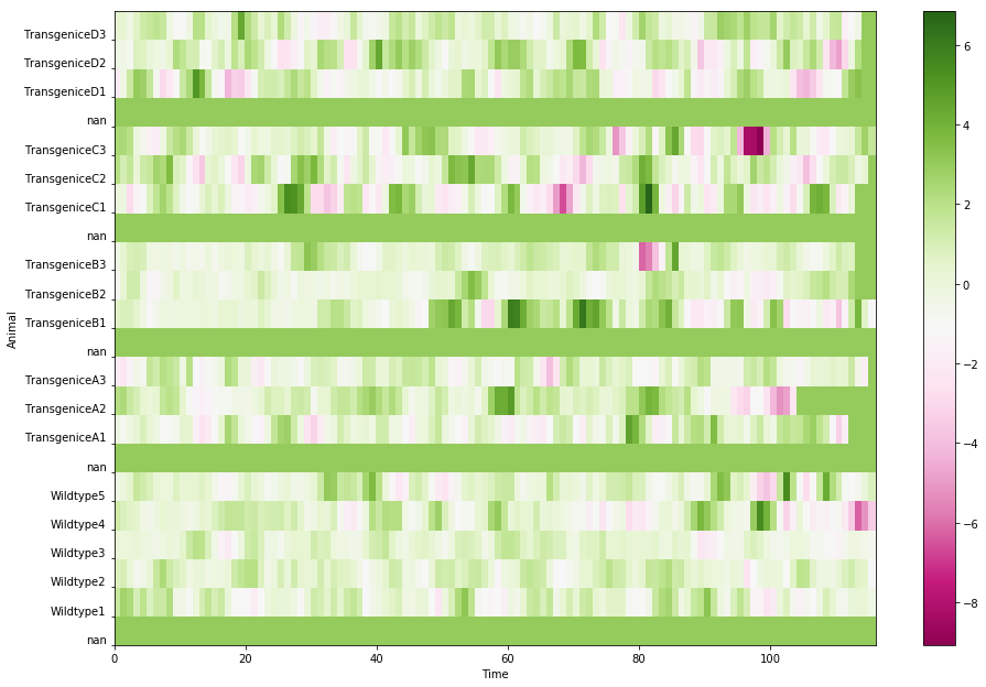
Back to the problem about how to choose the fill value, if I were to choose a smaller number, 3:
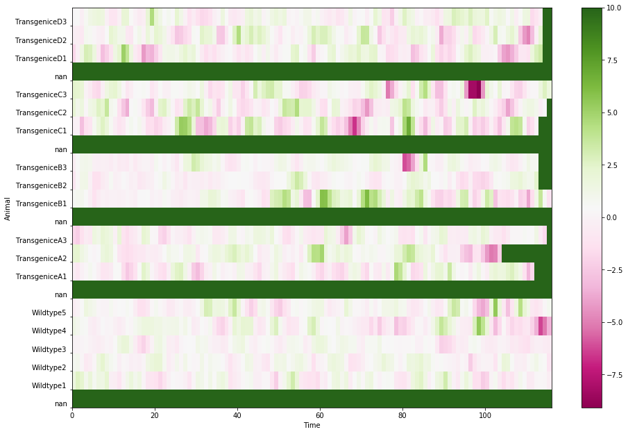
Or if I choose a bigger number, 10:
I know there must be some other better way, but what I’m trying to do here is to have a nice-looking background color that contrasts well with the data themselves, and additionaly provide a good contrast among the data points as well.
Which heatmap do you like better? The longer code, or Seaborn?